Client:
48 Hour Design Challenge
48 Hour Design Challenge
It’s 2040. Self-driving cars now make up over 50% of the cars on the road. Just joined a start-up company looking to re-design the self-driving car. The designer's task is to research and design UI prototype for the vehicle in a single weekend.
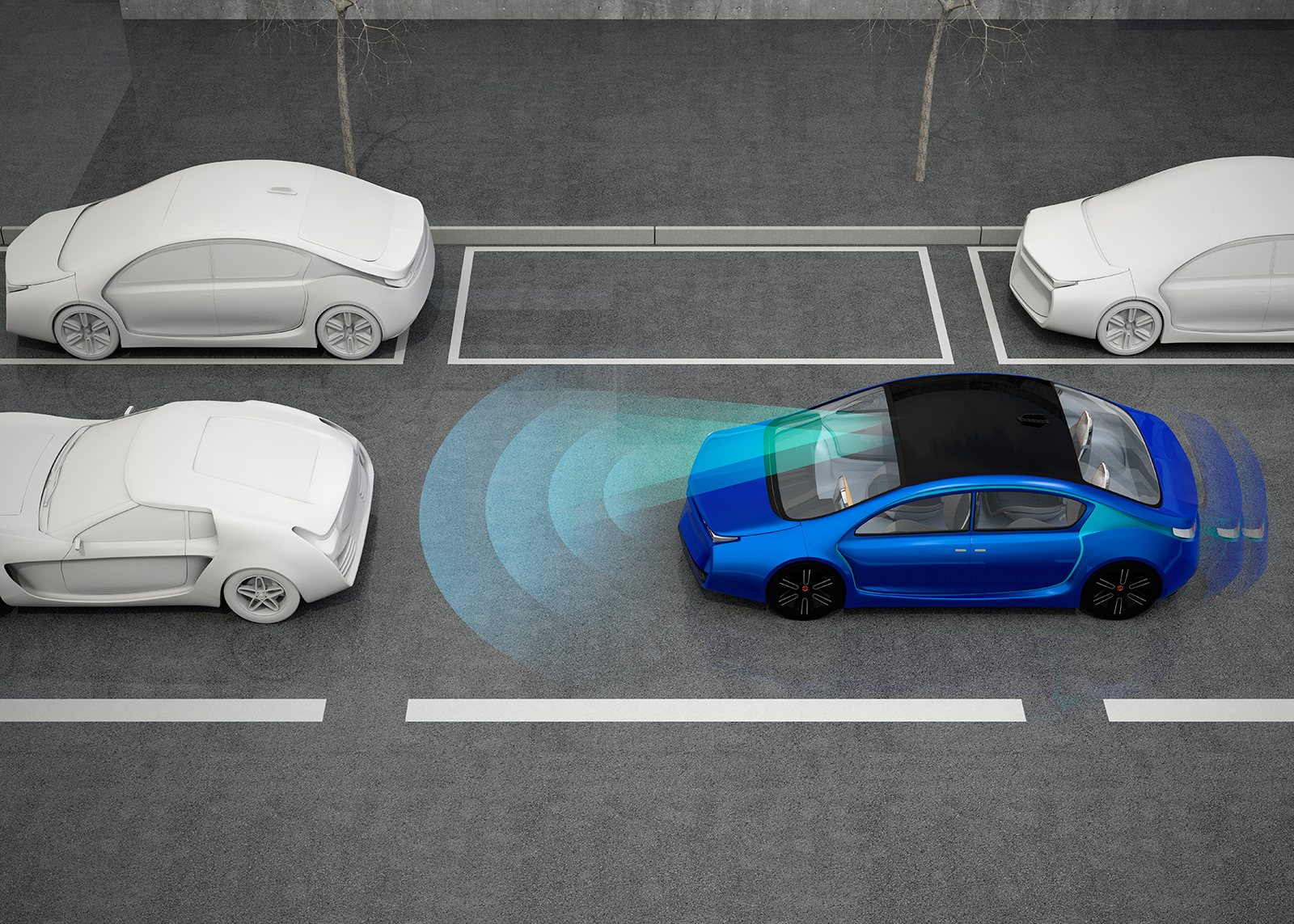
Weekend design challenge to do research and provide a solution.
User-Centered Design Canvas
- A start-up company looking to re-design the self-driving car
- How easily and successfully was the user able to jump in and use the UI?
- Does the starting point make any difference in whether the user is successful in reaching their goal? If so, what are the differences?
- What paths do users take to enter a destination?
- What obstacles do users encounter on the way to complete a specific task?
- How did the users feel about the effort and steps required to complete a specific task?
- Errors of omission
- Gather feedback from users for improvements
- Number of tasks completed with and without assistance
- Appropriateness of UI’s functions to users’ tasks
- Perceived amount of time and number of steps
- Ease of use overall
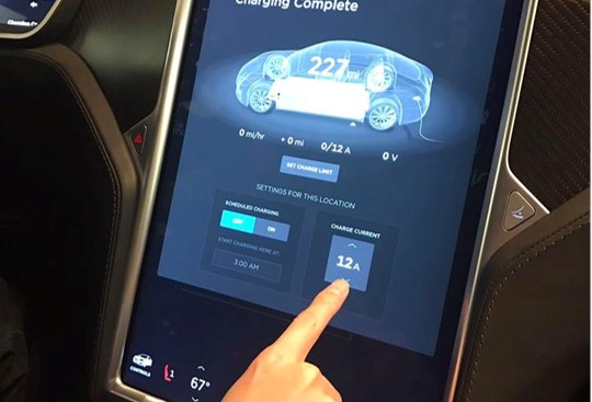
- Visited Tesla and studied their design approach
- Gain insight such as access the mileage left on battery is hidden
- Studied how they implemented the climate control
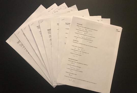
- Collected survey about current driving experience
- Collected feedback on UI Design
- Youngest participant is 12 Years Old
- Oldest participant is 72 Years Old
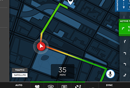
- Sketches and wireframe different components
- Created and adjusted comp based on surveys
Features which builds trust and/or adds value to the occupants
- Speed Rate of Travel
- Placement of vehicle among Traffic Flow
- Blind Spot, Lane Detection and Car Collision Visual Indicators
- Fuel and/or Battery Levels – Condition of Car
- Time/Date
- Ability to know who’s in the car and personalize dashboard and preferences to the driver through keyless fobs/mobile device
- Conversational/Social experience through voice features
- Keyboard, Voice and Gesture Input Options
- Current Weather and Predictive Weather while in commute and at arrival
- Suggestions or reminders when leaving or arrival
- Identify passengers to set preferences
- Set workflow on a mobile device and have the car sync over-the-air
- Mobile App to be competitive in the market place as higher-end cars it’s more standardized
- Accept or Decline New Destinations by Parent
- Disable Manual Control and/or Prevent Speeding (ability to reduce horsepower on performance models)
- Instate Curfew Reminders
- Arrival Notification to Parent
- Access Control Management to Car
- Geo-Location Violation Notifications (Skipping Class, Unknown Destination)
- Pull location from driver’s contact list on phone, if approved by parent
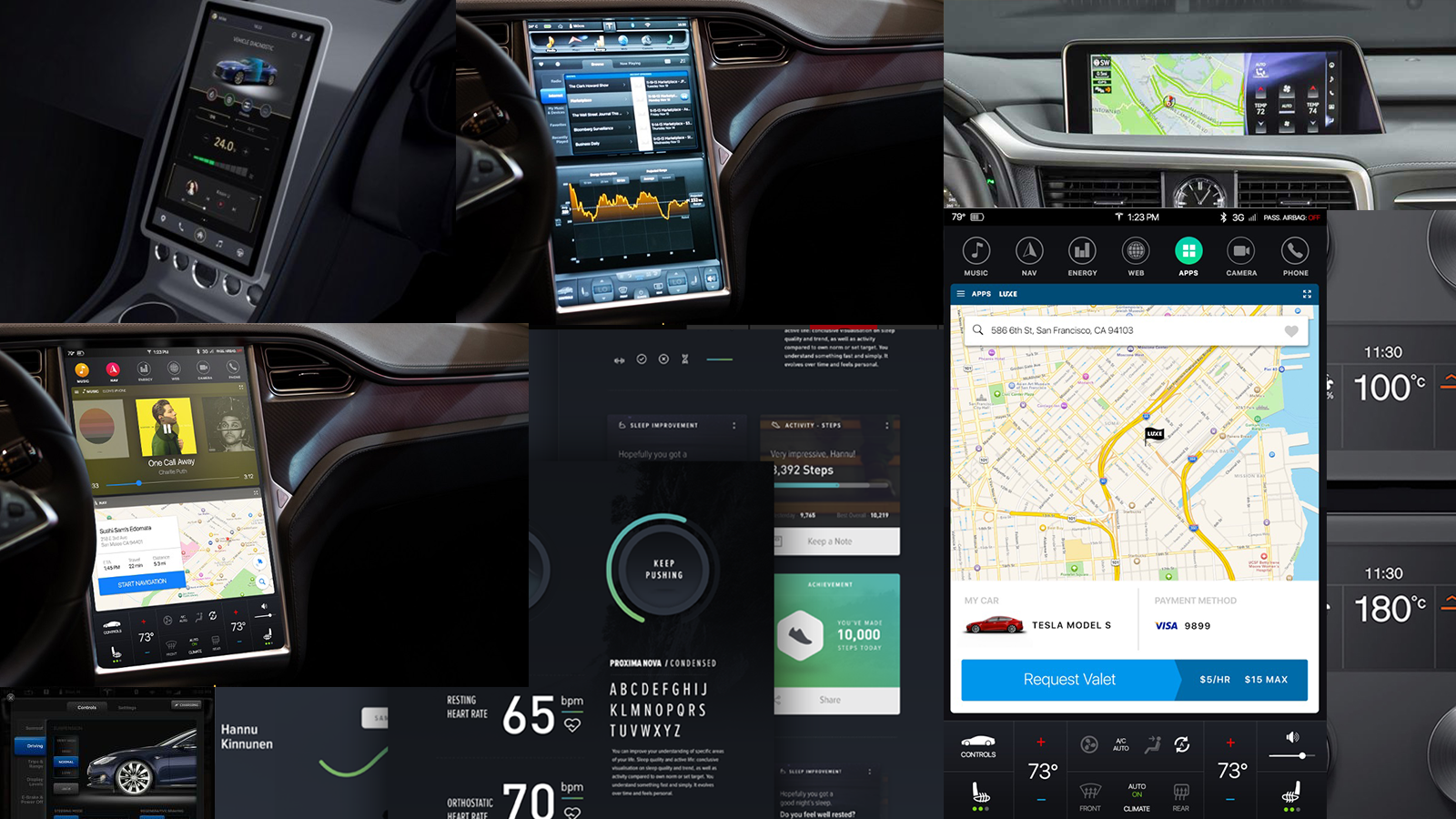
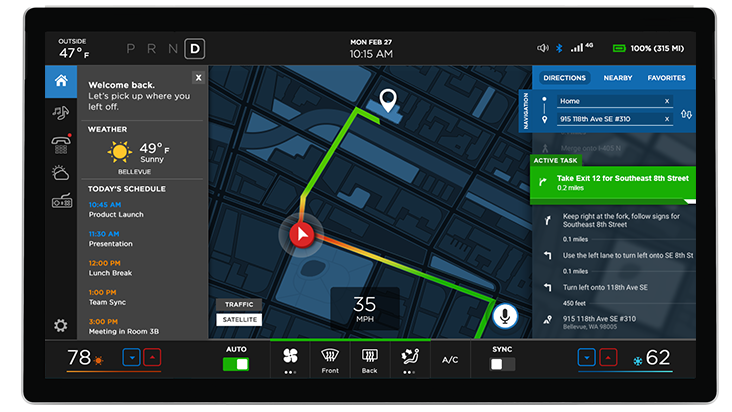
The design approach is based on building on user’s previous knowledge and experience, the design incorporates basic operational controls from traditional vehicles such as climate control, access to weather and core functionalities. The visual design is to create a professional polished UI to provide an increase sense of quality, satisfaction and trust into our complex autonomous vehicles. The new platform is designed to increase productivity while on the go.
- Thought Process & Approach Involved
- Research
- Idea Bubble Map
- Mind Dump
- Sketches & Wireframes
- Usability Survey & Testing
- Really quick to pick up on the UI
- Understood how navigation works compared to older audiences
- Excited to see a digital platform for driving
- Had difficulty understanding a full UI design, still attached to physical gauges
- Immediately wants to know where the emergency flasher/SOS button
- Comfortable with the design and understand where they are through prior experiences with navigation
- They have complete or more trust in the system
- Prefer UI to be flexible and hide information
- Open and accepting of the UI design
- More concerned about amount of entertainment than the actual route or current process of the car
- Markers made the screen too complicated
- Dials didn’t work with the design style
- Designed to have quick glance of temperature
- Drew bubble map to expand on devices that share similar characteristics and studied their approaches (oven, heater, A/C, fireplace, etc.)
- Overall, feedback was very positive
- Accepting of the UI and understood the principles
- Most users didn’t care about the weather
- During the survey, no complaints about the learning curve being steep.
Thank you for reading!