Client:
Senhoa - Nonprofit
Senhoa - Nonprofit
Senhoa (pronounced “suh-no-a”) is a combination of two Vietnamese words – “Sen” (lotus) and “Hoa” (flower). A lotus flower grows in muddy water and rises above the surface to bloom with breathtaking beauty, untouched by its impure surroundings. Using this imagery, “Senhoa” was conceptualized in 2007 to represent women and children, vulnerable to sexual abuse, exploitation and trafficking. The Senhoa lotus flower is an enduring symbol of innocence, resilience and hope.
The word “Senhoa” and the Senhoa lotus logo is a registered trademark, pertaining to Senhoa Foundation.

Through the use of Adobe Illustrator, the goal of the logo design is to illustrate a lotus with a lily pad.

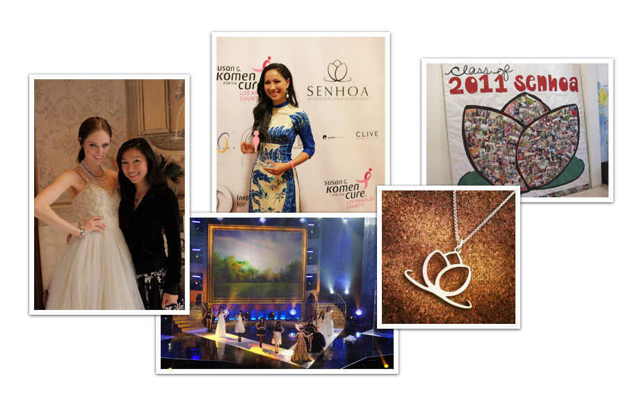
Through the use of Photoshop, this a page design concept for the "Coco Rocha for Senhoa" to raise awareness and funds for the nonprofit.

Original design was low quality and not a vector graphic. Took the opportunity to design a new identity. It’s an elegant but minimalist approach to the identity. The logo is used in marketing and various jewelry.